An engaging new homepage for Channel 4’s on-demand streaming service
Role
UX Lead, Cross Platform and Web
Responsibilities
Product Discovery, Personas, UX Direction, Design Principles, Accessible design
The challenge
Users looking for something new to watch make up a significant portion of visits to Channel 4’s streaming apps. Since these journeys often start at the homepage, we wanted to see how well the homepage was performing for these users. Through data analysis and user feedback we found several opportunities for improvement.
Users found the homepage overwhelming
Some users reported a sense of overwhelm when browsing the homepage. For them, there was just so much stuff that making a choice became too difficult.
The homepage is long and repetitive
On all platforms, the homepage presented as 20+ rows of identical carousels, often with the same shows appearing in different places. Users told us this caused quick disengagement and frustration.
Hard to showcase the breadth of content
Our editorial team told us they needed a way to boost specific content around certain times of the year eg Oscars season, or Pride Month. The existing design wasn’t very flexible.
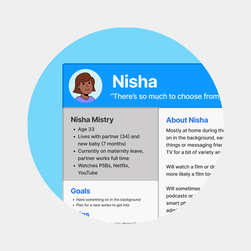
Personas became a valuable artefact the design team could align around, design for and encourage user advocacy with. I created this set to highlight the specific challenges users have when finding something to watch.
Design approach
We focused on reducing the sense of overwhelm and increasing page engagement. The proposed design revolved around two ideas:
Content grouped in sections will help users navigate and reduce overwhelm
Size and layout variations for different content types will help engagement and boost seasonal content
With this as a guide, we came up with a set of component types that could be pieced together according to the needs of the editors at any given time.
We created a wireframe prototype of the new homepage components mapped to real content. Our aim was to create a sense of pacing and rhythm as users browsed down the page.
Creating the visual style
It was crucial to reflect Channel 4’s new brand identity in the design. Striking colour contrasts, simple yet bold typography, tight layouts and sharp corners became hallmarks of the visual design language.
In keeping with the overall brand concept, colourful gradient images were used to signify new ‘worlds’ of content for users to explore.
Progressive disclosure on focus keeps the UI uncluttered. As more text is revealed, the image darkens to ensure compliance with WCAG 2.2 AA.
Show branding and synopses shrink as trailers begin to play, adding emphasis to the content.


